Naga Architects
Precision in the Making
Opportunity
NAGA is a provider of comprehensive Architectural services across a wide range of projects and localities who has built up a prestigious and respected name. NAGA Architects approached Ochre to help them to embark on their next step to become the first choice of property developers throughout the Middle East and eventually the world.
Solution
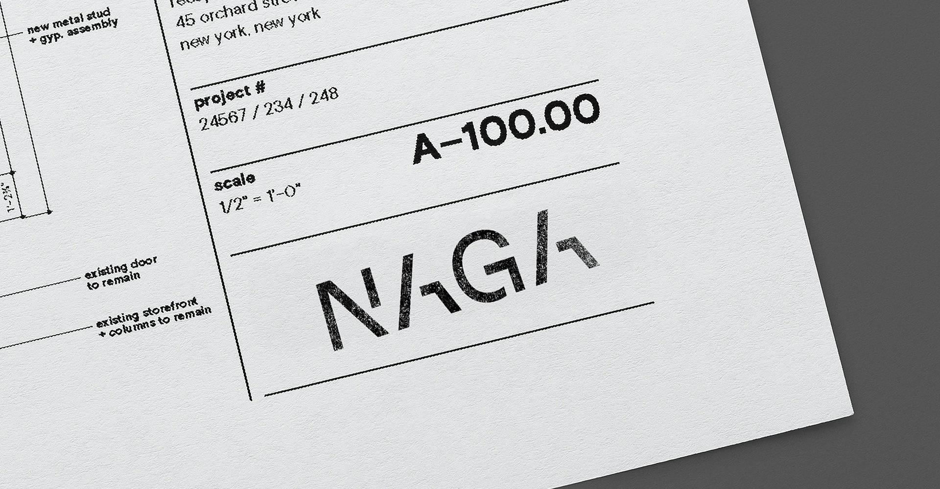
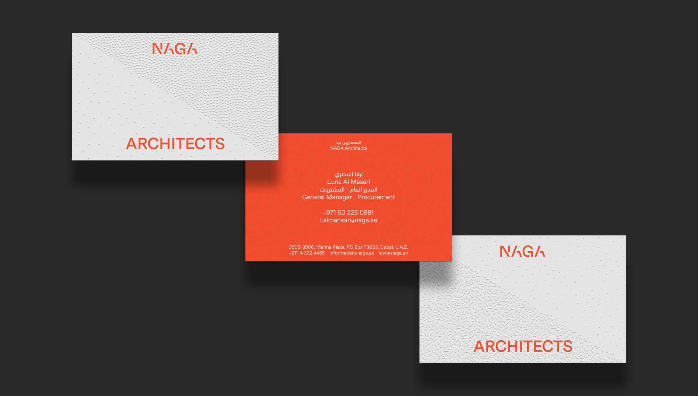
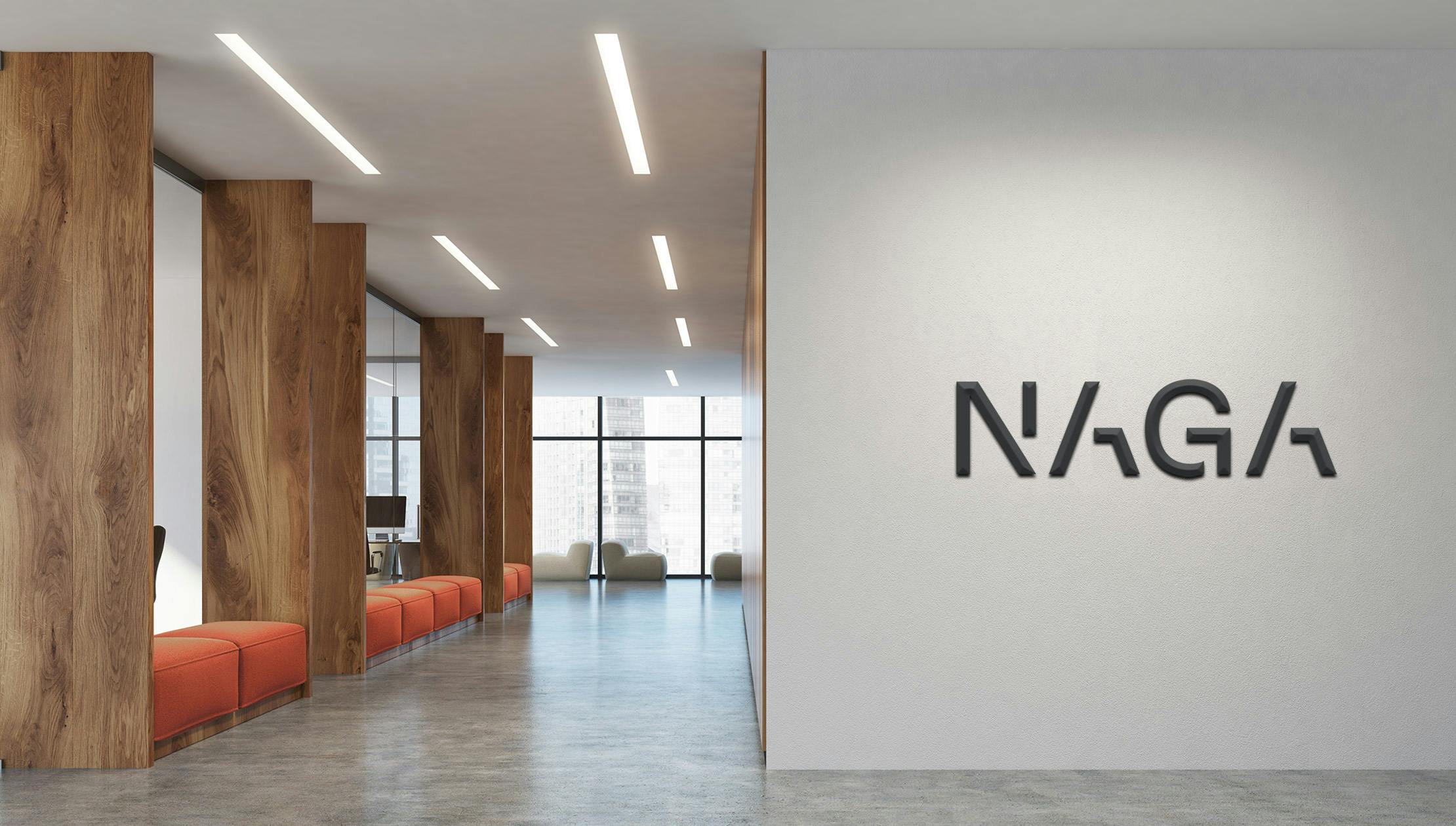
It became clear that NAGA Architects delivers attractive designs to support a quality of home and community life unsurpassed in the region. Rather than placing money before people, the firm does not compromise on servicing the needs, expectations and dreams of its clients. The essence of the identity was largely inspired by architectural drawings and patterns derived from legends denoting different materials. We also identified that triangles are utilised in architecture for both aesthetic and functional purposes, being the strongest shape to use in construction. Using the negative space of the ‘N’ of NAGA we allude to the triangle whilst also allowing a subtle link to the brand name to punctuate all communication touchpoints. The ‘N’ element of the visual language also creates a clear split, allowing for it to communicate the intersecting properties of social, economic, physical and environmental aspects that contribute towards good design.
Result
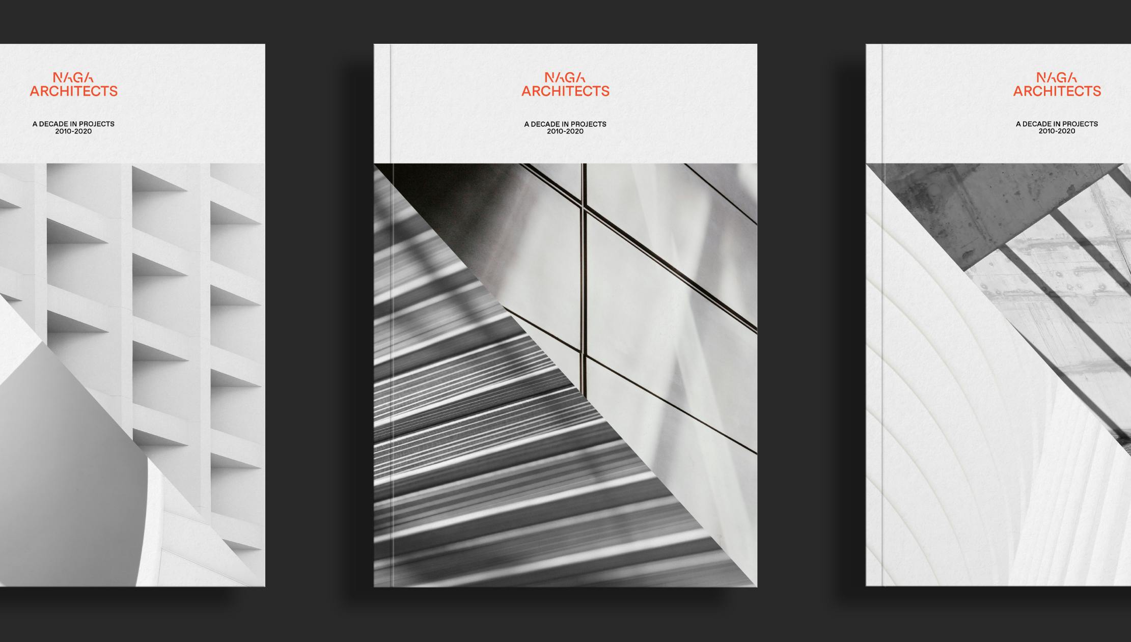
The newly developed identity not only captures NAGA's immense level of professionalism but also illustrates the firms balanced approach to design, technical competency and service they provide to their customers. It will position them well amongst their regional and global competitors and set them up for their next phase of growth.


