Spectra
India Deserves Better
Opportunity
Spectra is a ten-year-old independent company, recognised by Netflix as India’s fastest fibre-to-home internet service provider. Born in the 21st century with ambitious, entrepreneurial owners, Spectra set out to transform broadband services in a market where fast, reliable internet is often seen as a luxury rather than a basic human right. Despite India’s vast population and hunger for connectivity, broadband services are typically slow, complicated, and capped by restrictions. With average internet speeds of just 4.1 Mbps and only a small fraction of the population having access to high-speed fibre connections, customers were left underserved. Competing mainly with large incumbents that lacked user-centricity, Spectra had an opportunity to challenge the status quo and show that broadband could be simple, fast, unlimited and customer-focused. To seize this opportunity and expand its reach across multiple cities, the brand needed to evolve, sharpen its positioning, and stand out as a credible David against the Goliaths of the industry.
Solution
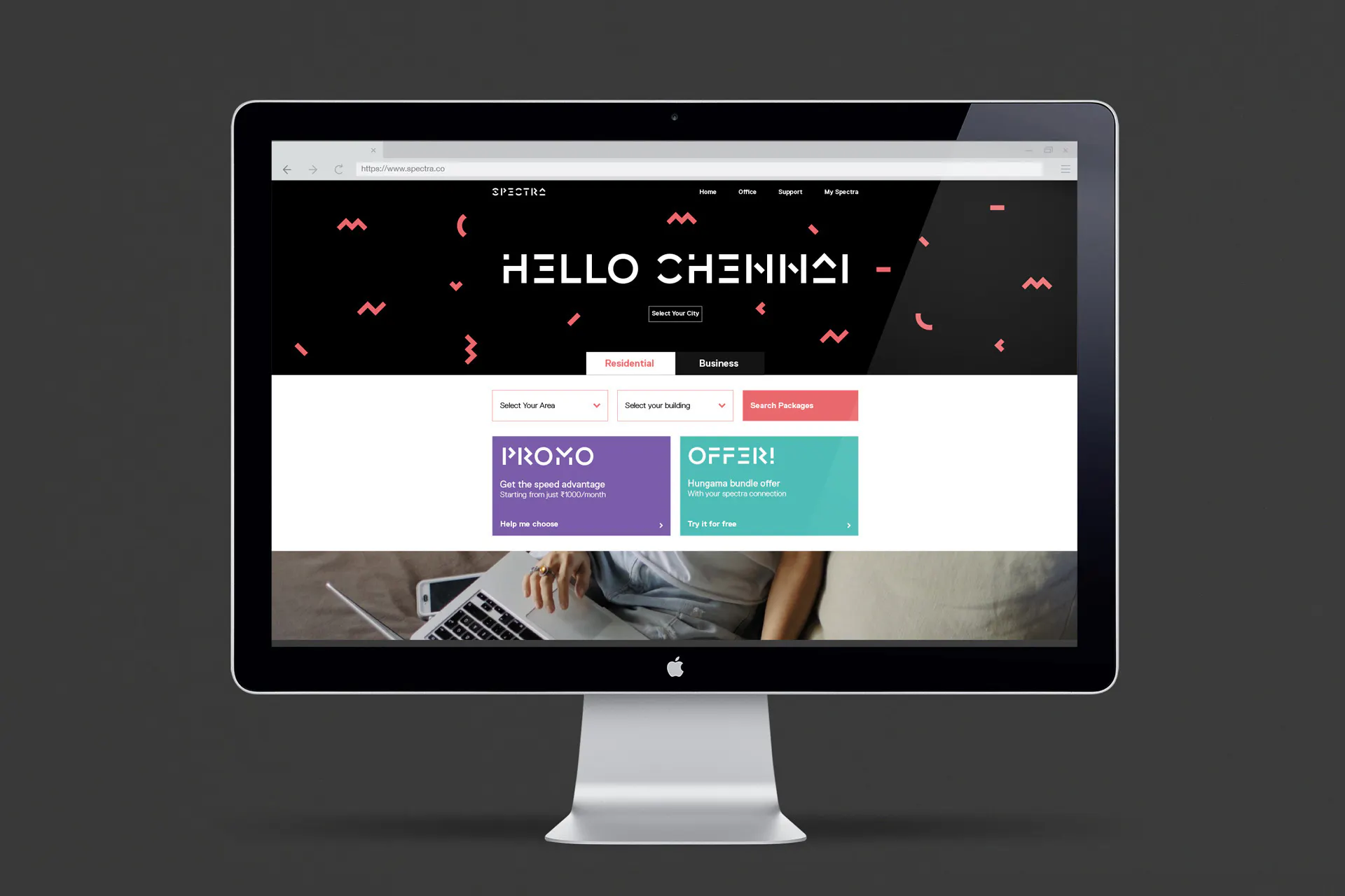
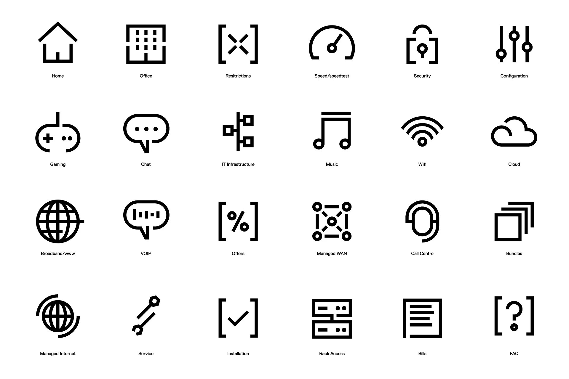
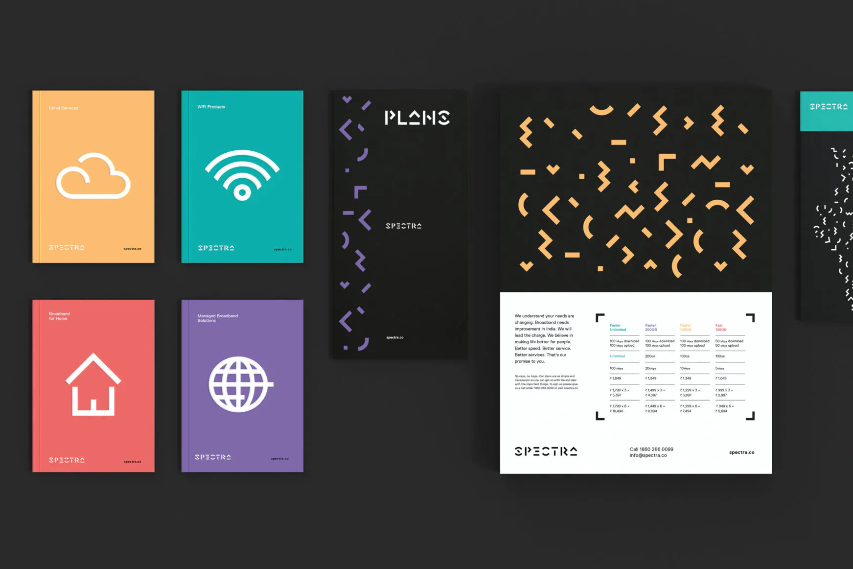
Working closely with the founders and leadership team, Ochre helped reimagine both the brand and the business. We combined a deep understanding of the Indian market with design-thinking and ethnographic research techniques commonly used by leading global tech companies. This meant truly understanding how broadband could improve daily life for both home and business users, and what barriers were preventing people from getting the service they deserved. Over an 11-month process, we ran collaborative workshops to road-test the future of broadband in India, redefine the service experience, simplify the customer journey through improved UX and UI, and focus the brand’s promise on four core behaviours. We shaped the brand strategy, naming, product categorisation, and launch planning, ultimately creating a disruptive identity system that put customers first while setting a bold new direction for the company.
Result
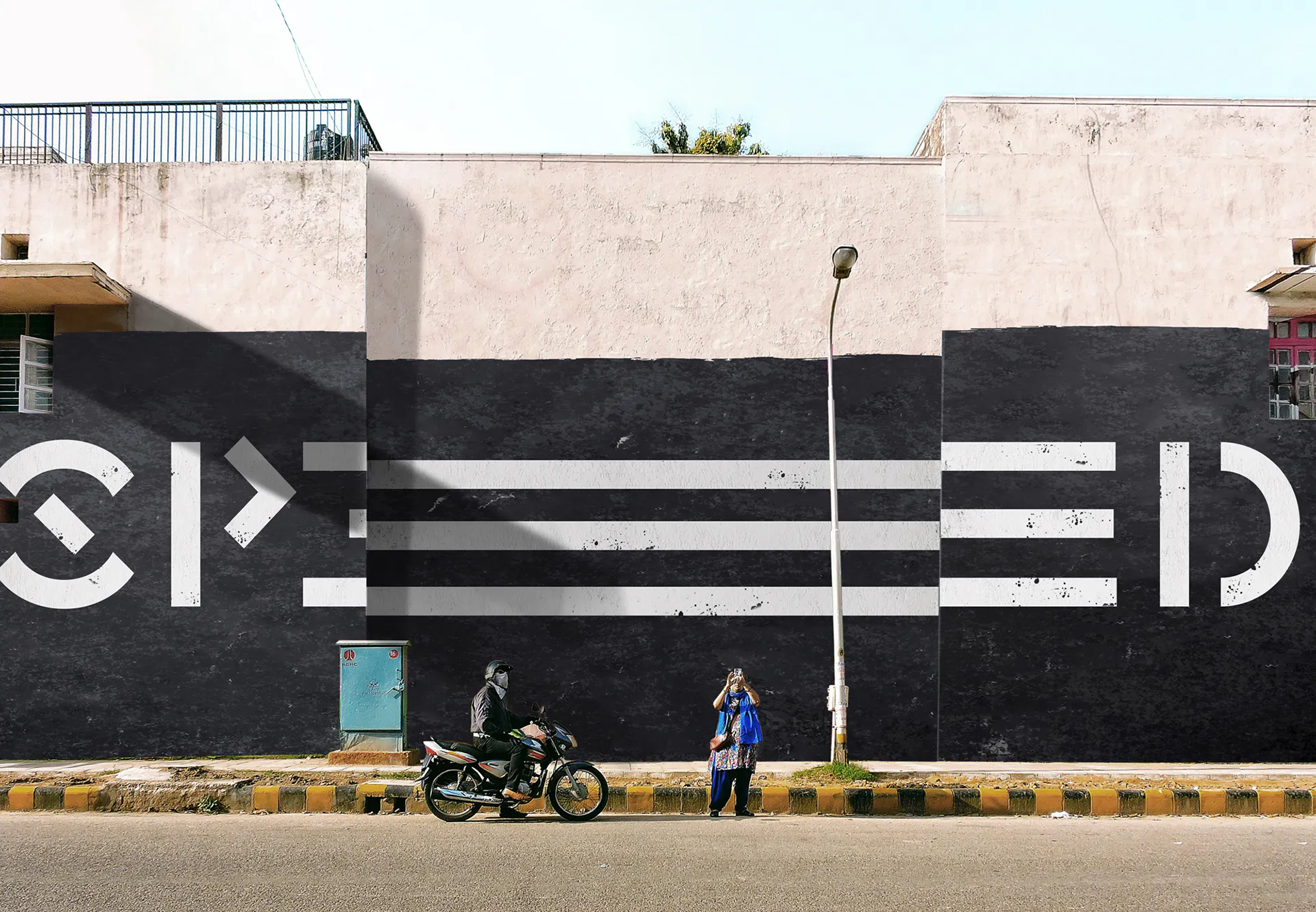
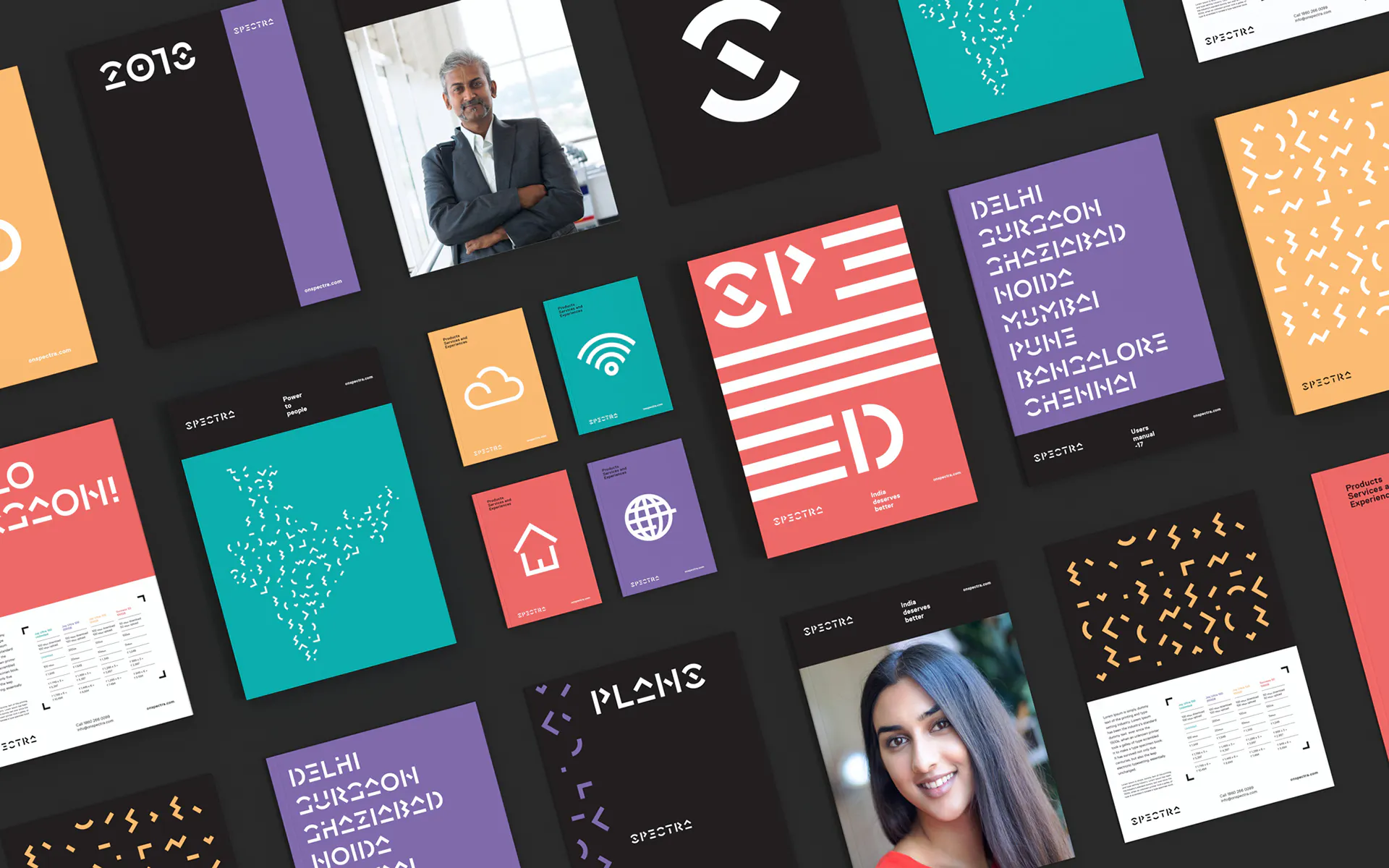
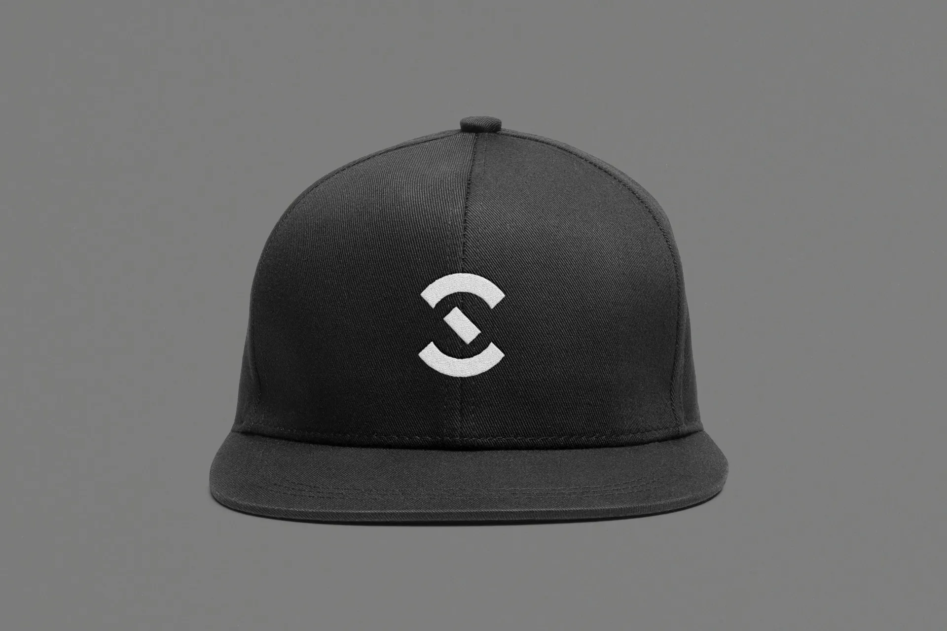
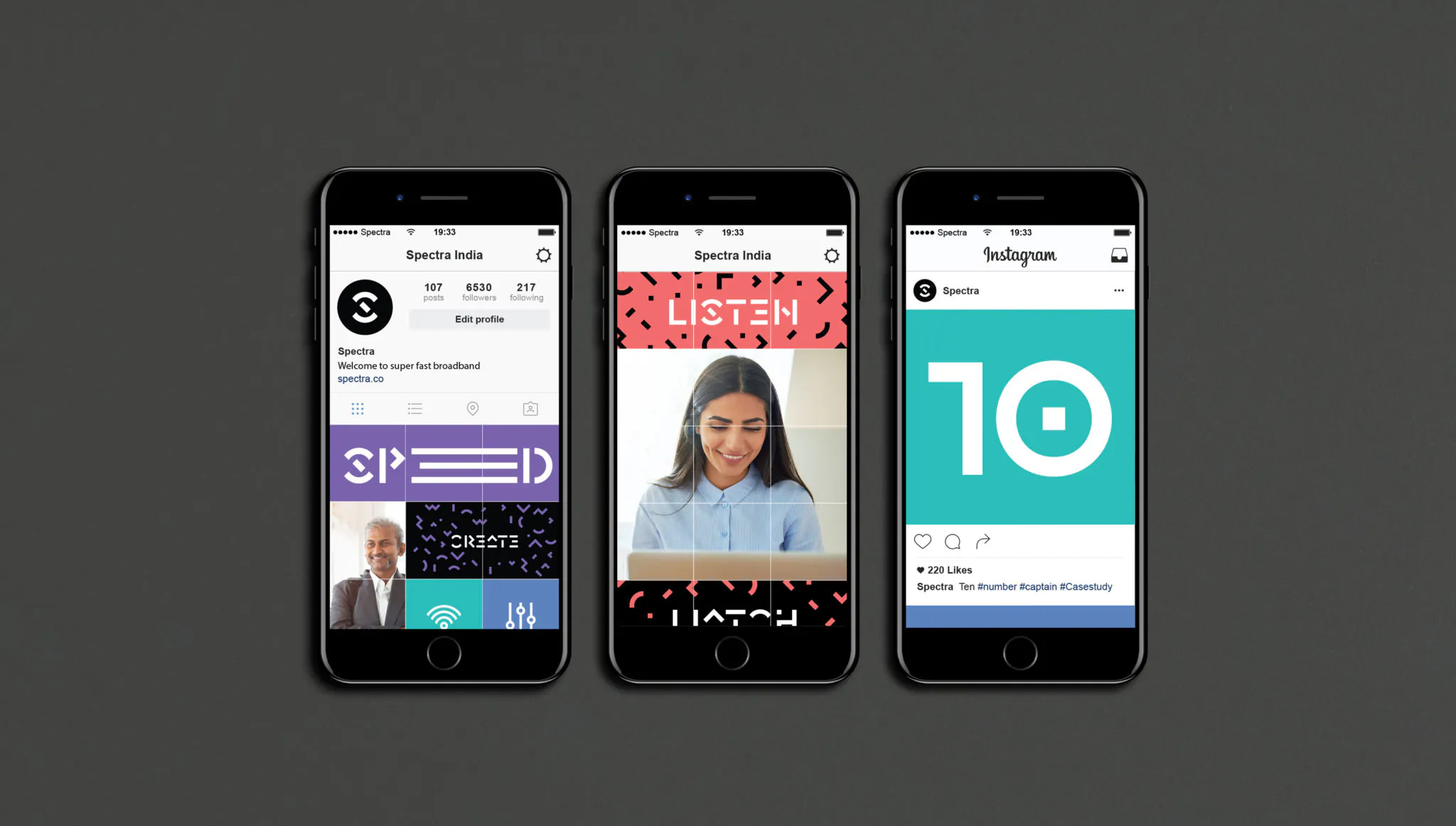
The new brand marked a fundamental shift within Spectra, moving the business from a purely engineering-led mindset to a customer-driven focus. It embodies the company’s disruptive spirit and ambition to deliver broadband as an essential, empowering service. A striking new visual identity, anchored by a custom-made typeface created with Rick Banks of F37, allowed Spectra to stand out and communicate with confidence across every touchpoint. Since launch, the brand has attracted new customers, significantly improved its Net Promoter Scores, and positioned Spectra as a challenger brand redefining what high-speed internet can mean for modern India.


Reimagining broadband through customer-first design thinking
We partnered with Spectra to shift the business from an engineering mindset to a truly customer-led brand. Using deep research, collaborative workshops and service design principles, we helped define a bold new strategy, simplified the user experience and created a disruptive identity that set Spectra apart in a neglected market.

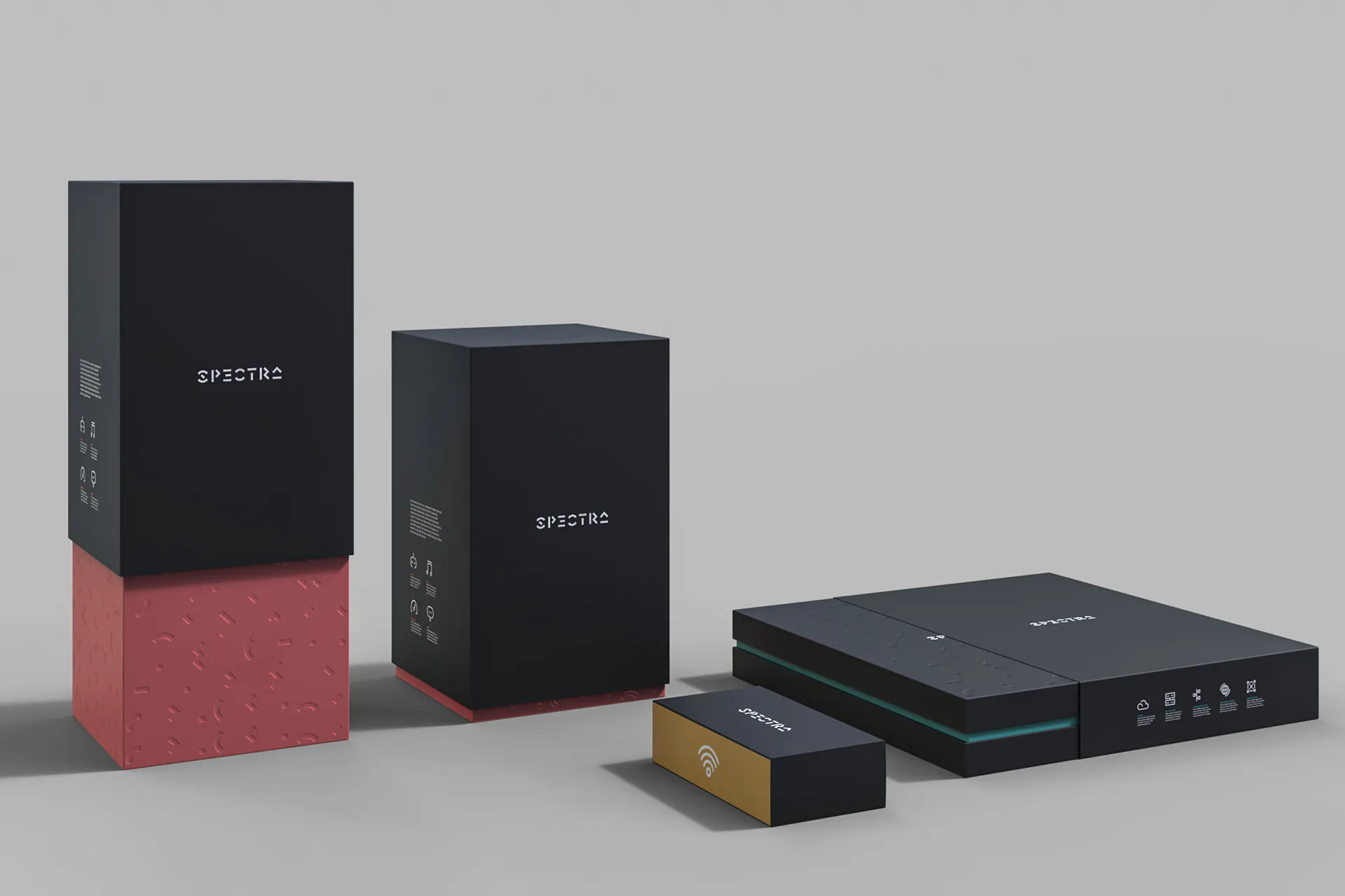
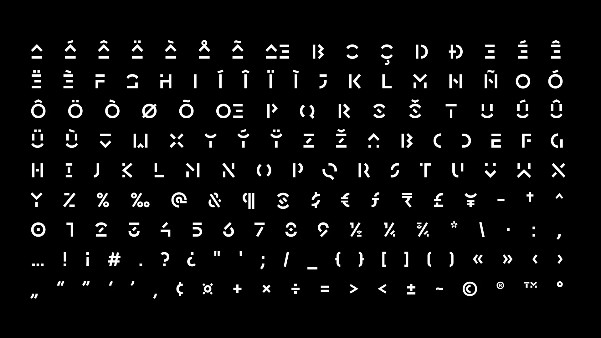
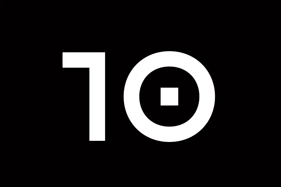
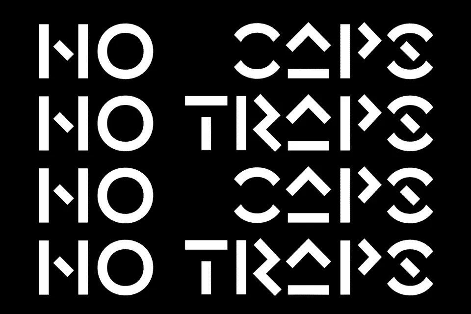
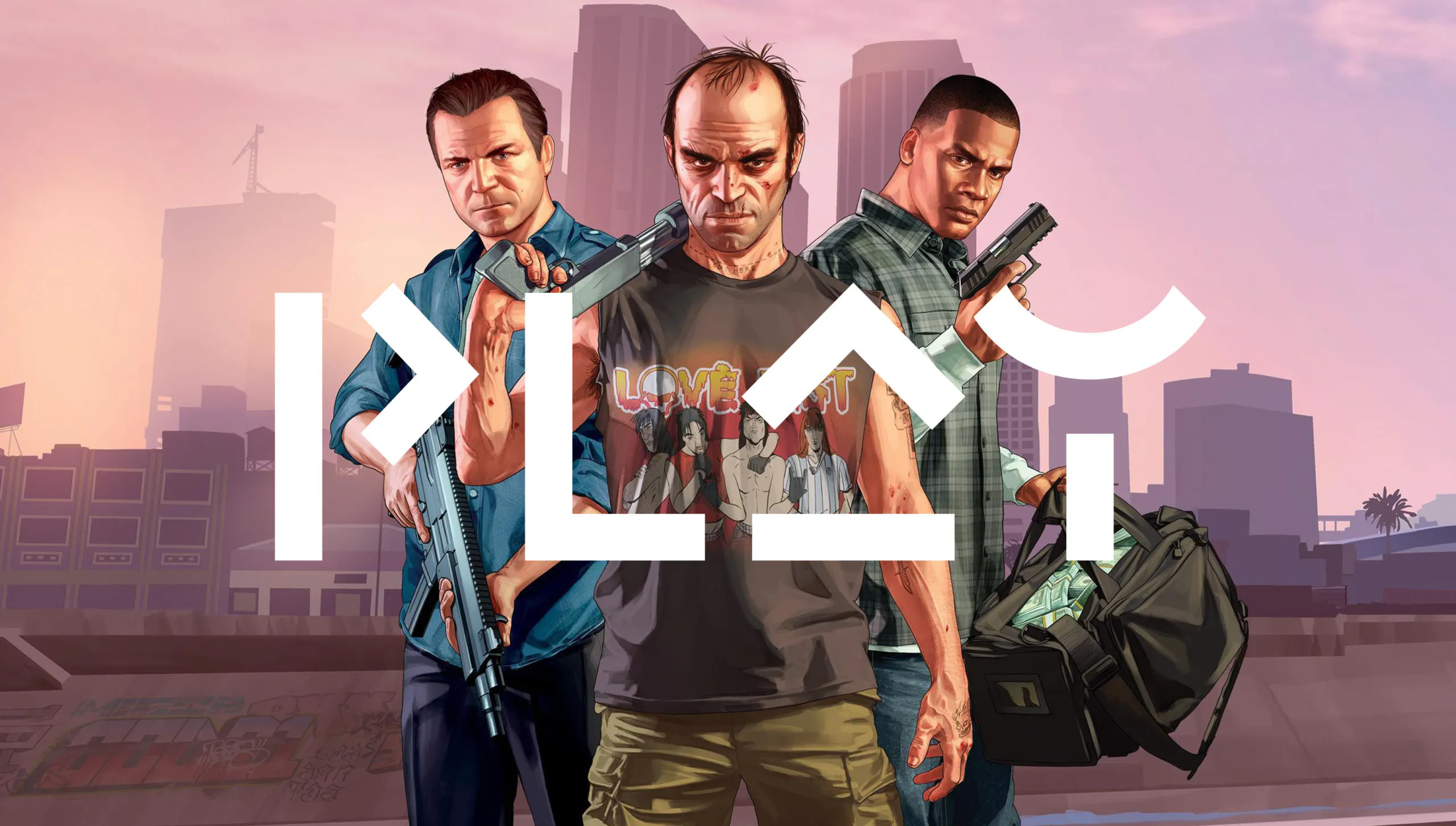
A typeface that breaks the mould
We designed a deliberately unusual, iconic typeface to serve as a standout element in the wider design system. Bold, sharp and instantly recognisable, it reflects the disruptive nature of the brand and speaks directly to a tech-literate audience, including gamers who expect their visuals to do more. This wasn’t about subtlety. It was about creating a visual signature that commands attention, challenges expectations, and becomes a memorable part of how the brand shows up in the world.